In close collaboration with Simply®, I was involved in refining and evolving the brand’s visual identity as part of the transition from Simply Chocolate to Simply. The rebranding was driven by a desire for a more simplified, timeless and story-driven expression – one that allows room for future development and new product categories.
The identity draws inspiration from the brand’s roots in Copenhagen, its uncompromising focus on natural ingredients and the philosophy Keep it Simply – a mindset centred on authenticity, simplicity and honesty. Storytelling became a key design element and is integrated across all packaging solutions.
The case includes the development of the following packaging types:
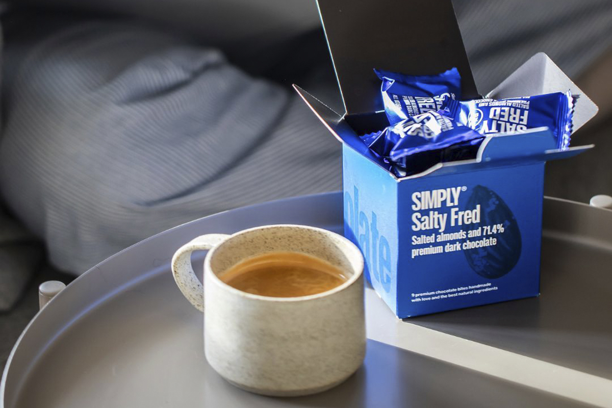
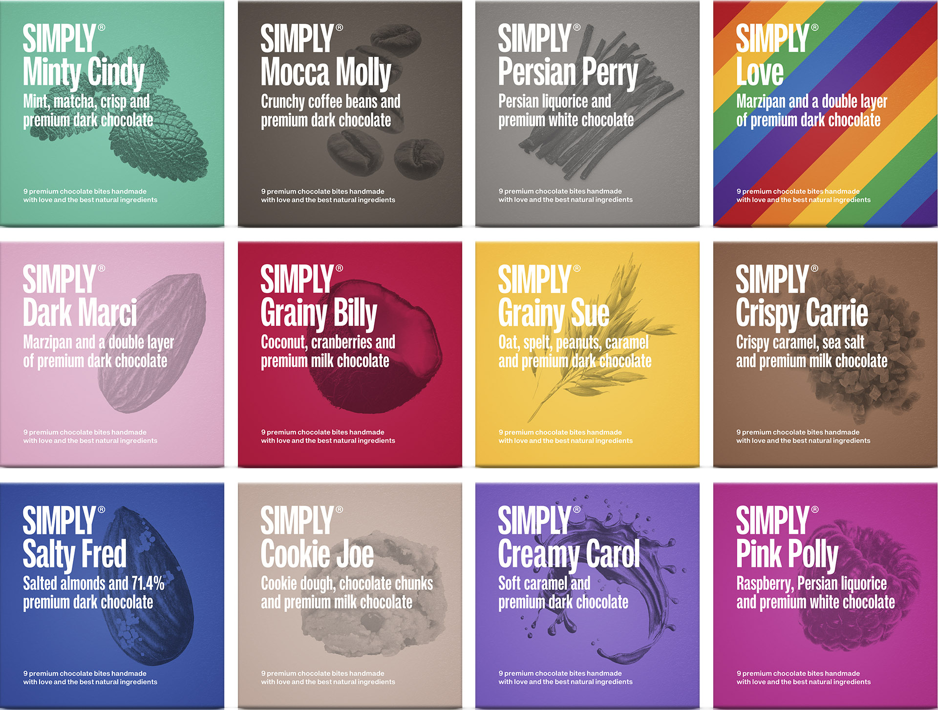
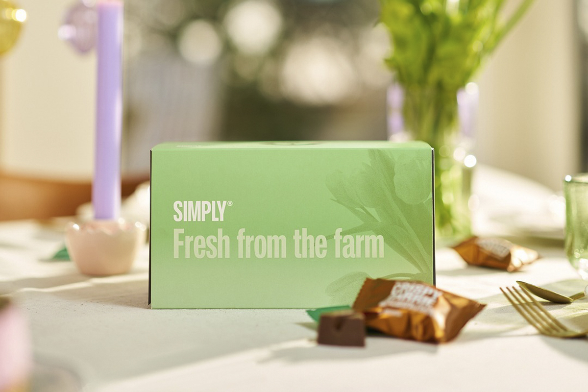
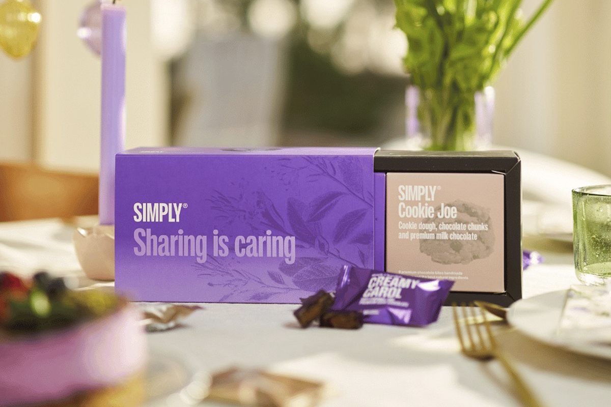
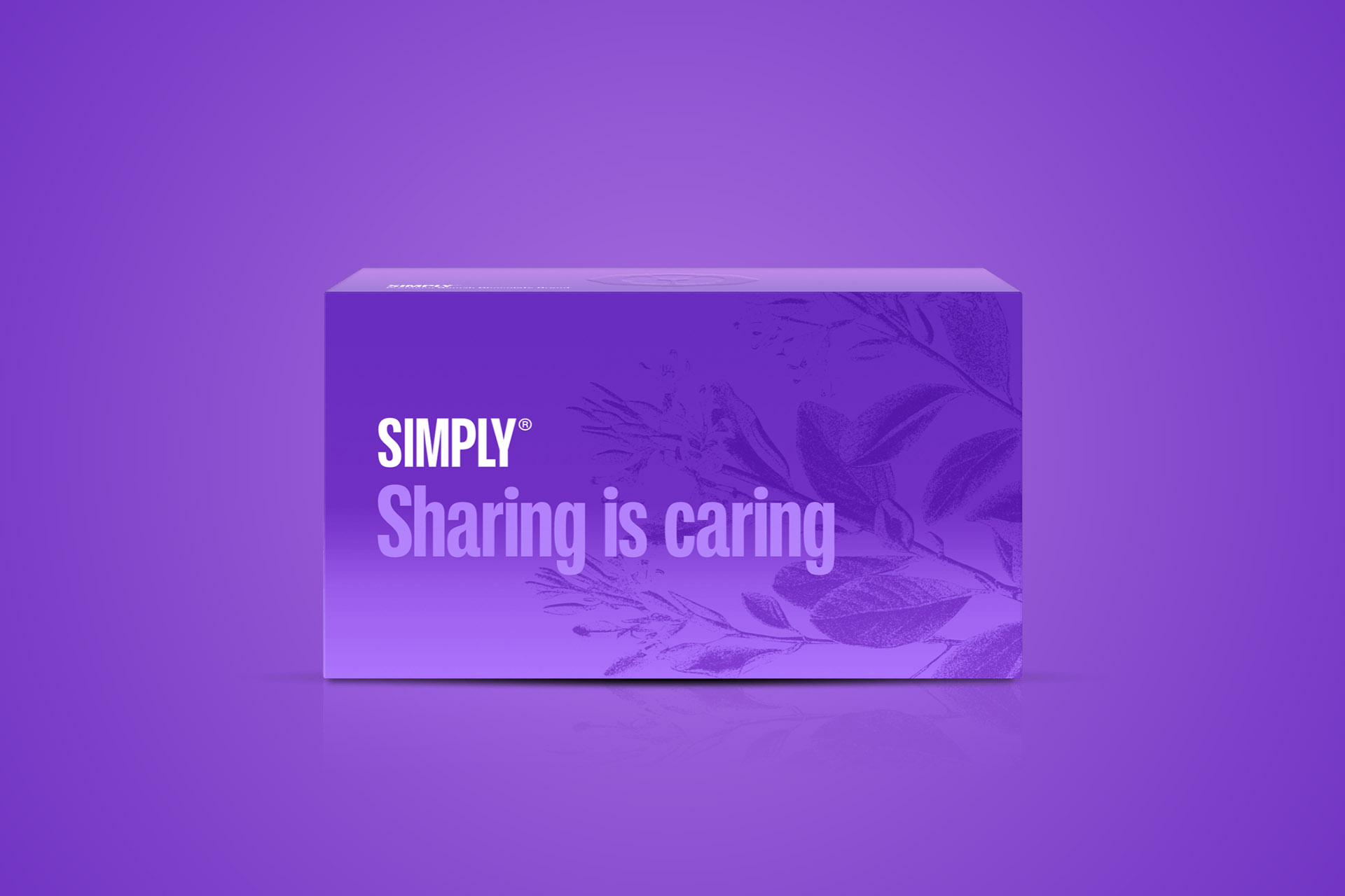
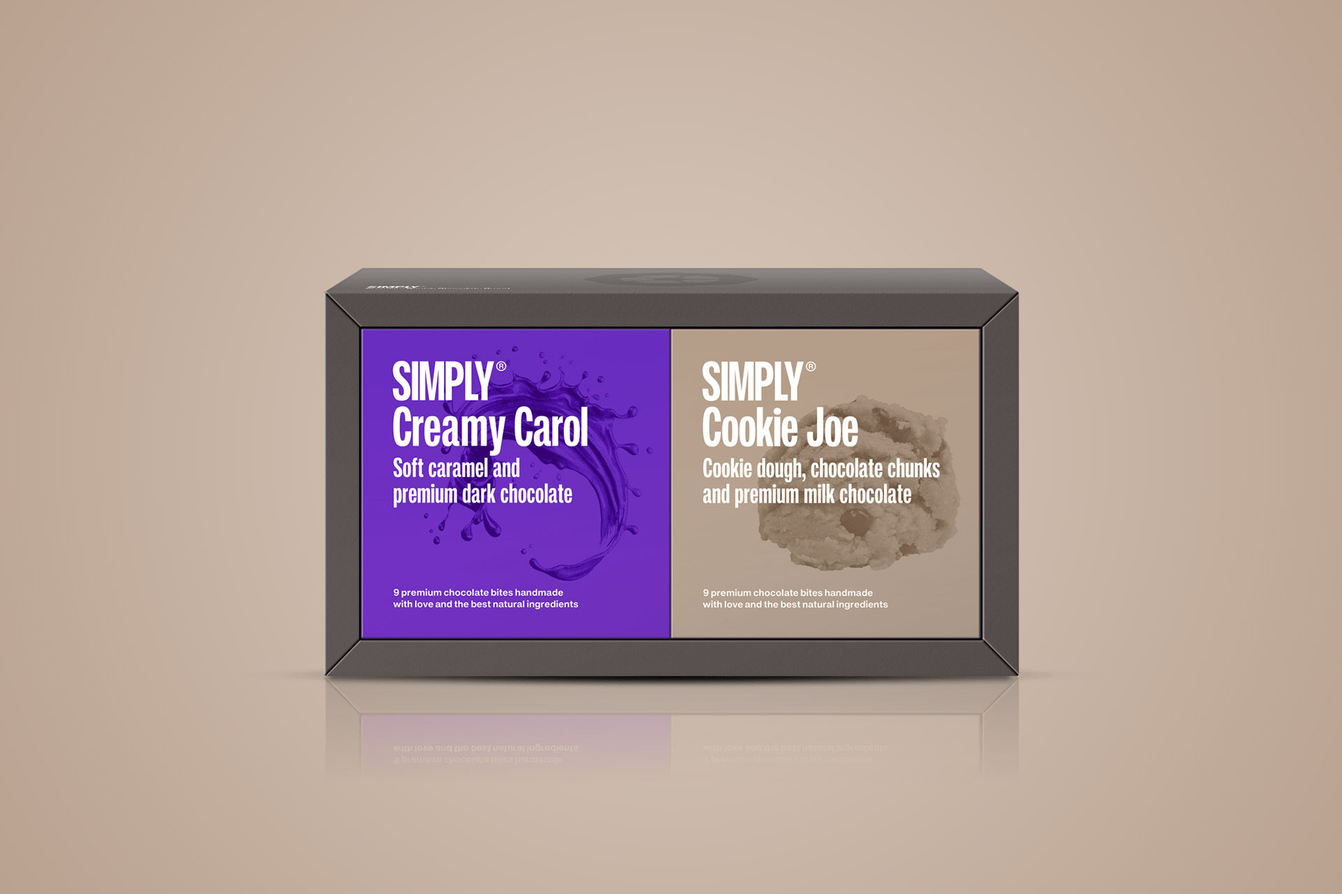
Square Cubes Square boxes designed to hold the brand’s flowpacks in different flavour variants. Each cube has its own colour, making the range easy to navigate. The design is enhanced with storytelling elements and spot UV details that create contrast and a tactile experience.
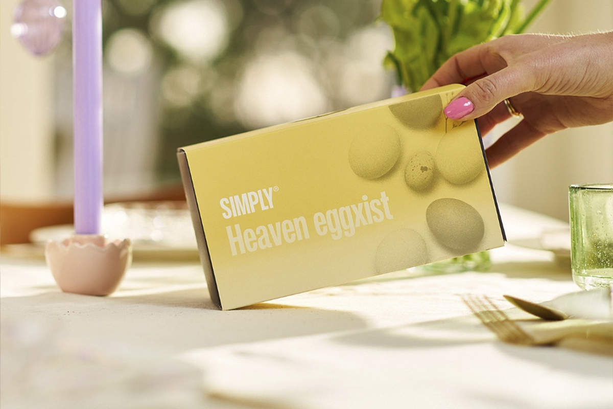
Generic Gift Box A flexible gift box that can contain various combinations of cubes and be adapted to different seasons and needs. The contents are defined by a sleeve that can easily be changed. Sleeves feature spot UV details, storytelling and quirky names with a touch of humour – such as the Easter sleeve “Heaven eggxist”.
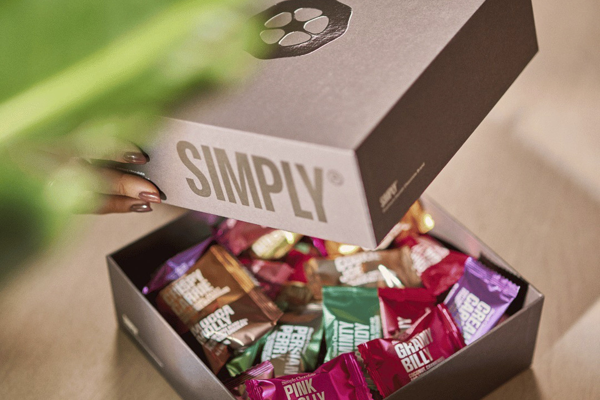
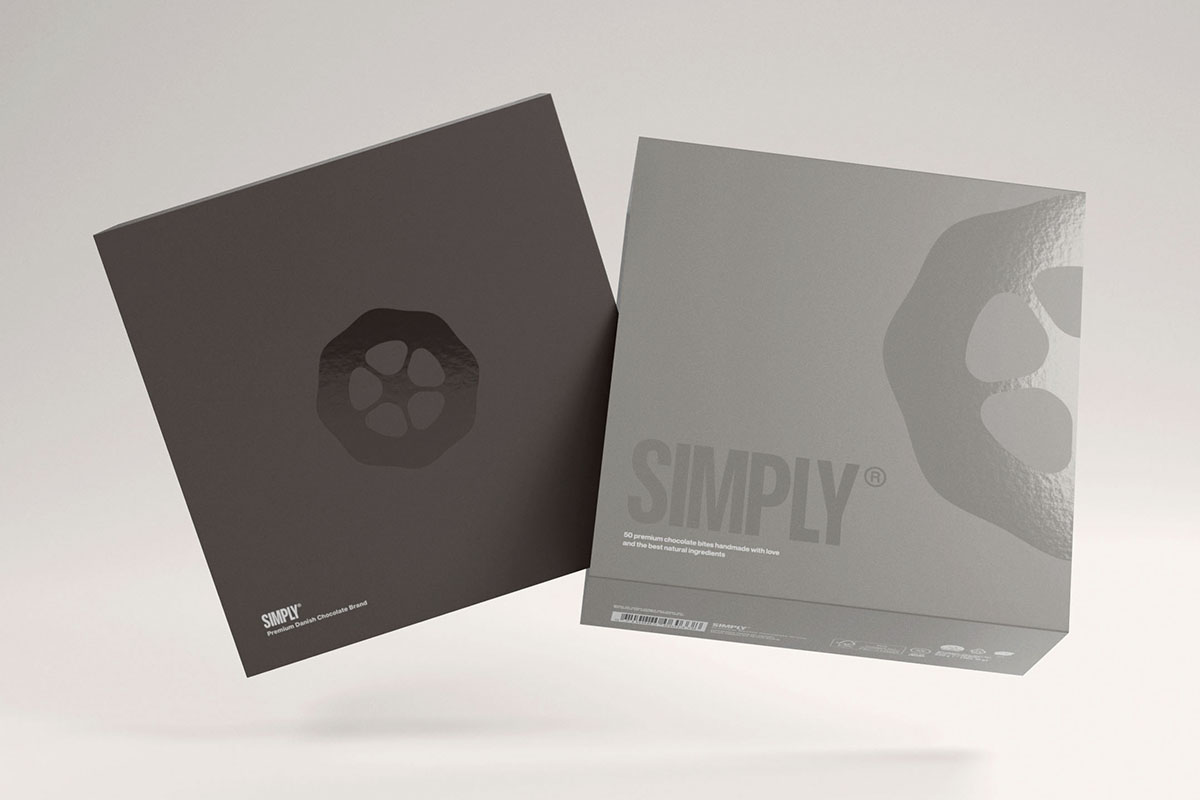
Premium Box A luxurious box made from rigid board with an uncoated surface, creating an exclusive and tactile feel. The box contains several flowpack variants and is finished with subtle spot UV details and storytelling graphic elements.
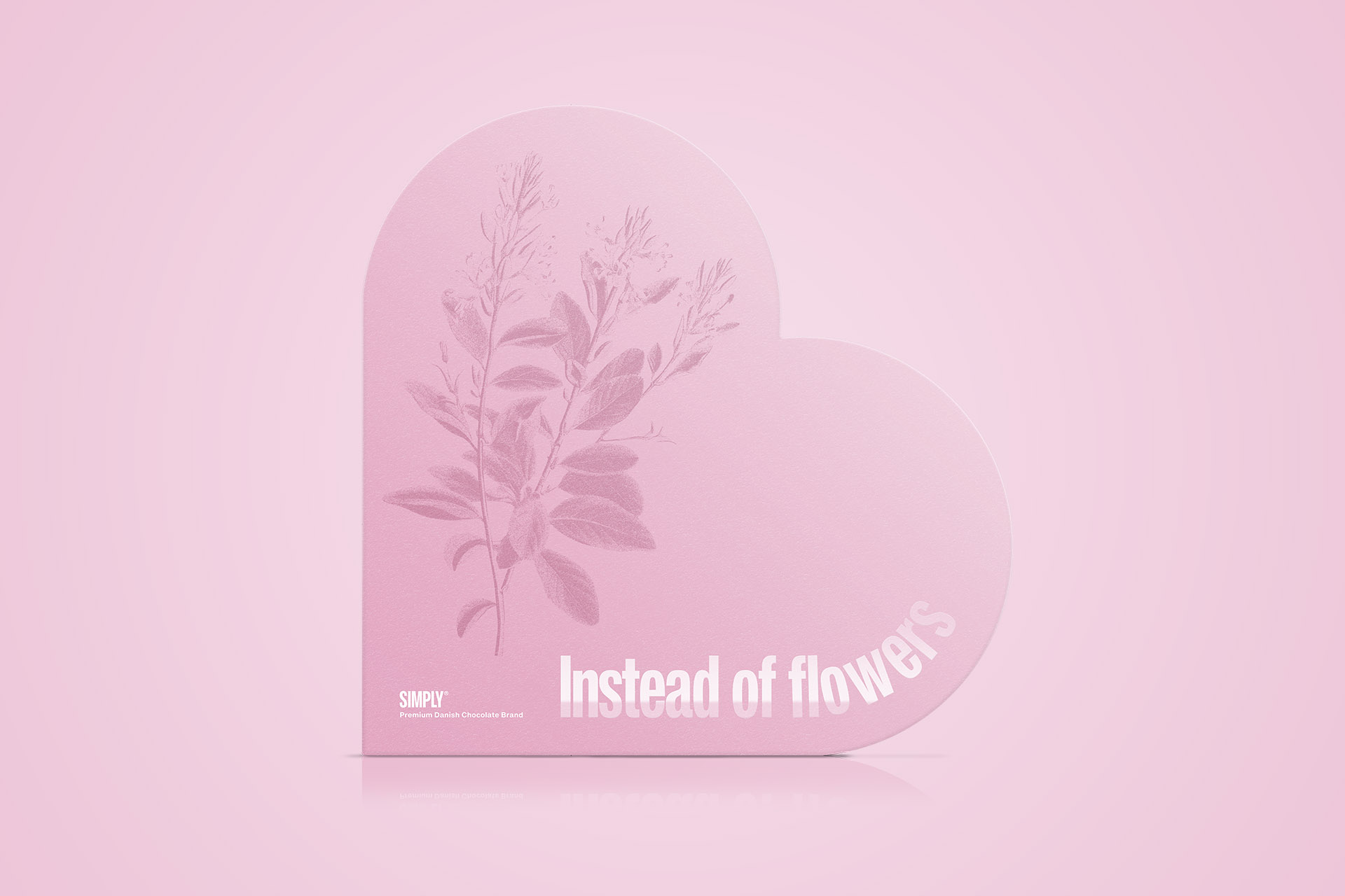
Heart Box A premium heart-shaped box made from rigid board with an uncoated finish. The design combines elegance with the brand’s signature humour and storytelling. The box is titled “Instead of flowers” and offers an alternative to the classic gift, filled with a selection of Simply flowpacks.